
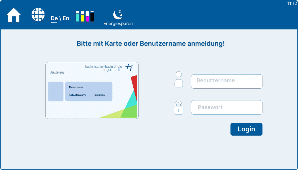
The operation interface of the printers at THI (Technische Hochschule
Ingolstalt) is confusing. As a UXD student, I believe there is great
potential for improvement in terms of functionality adjustments,
categorization, and page design. First, let me analyze the existing
problems with some examples.
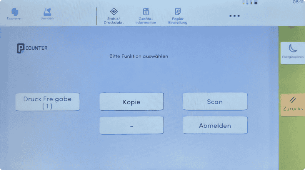
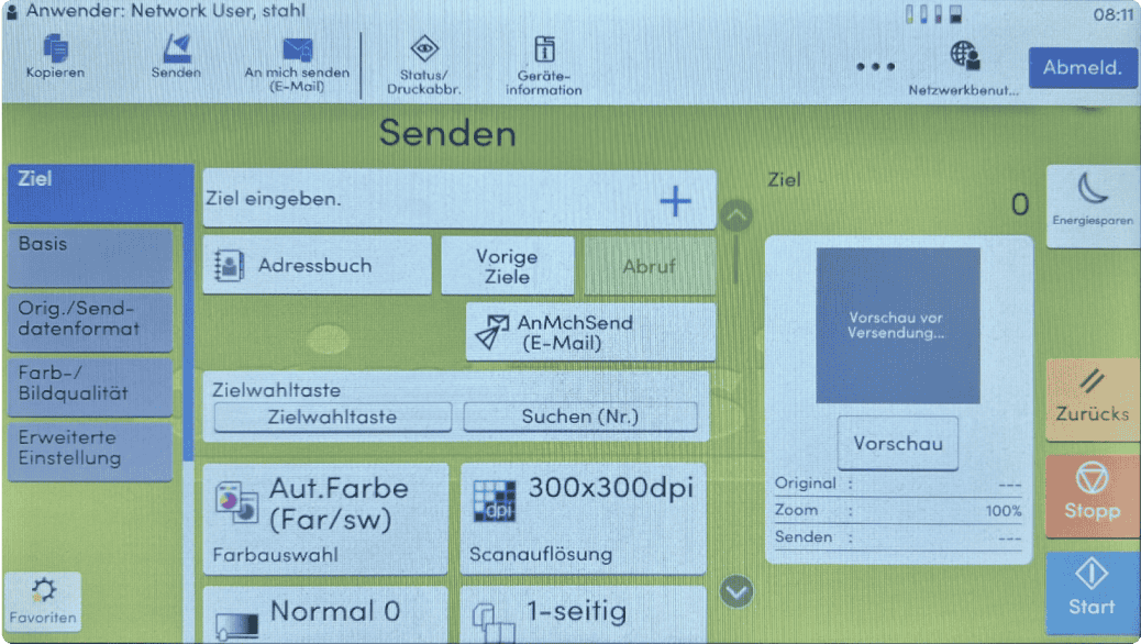
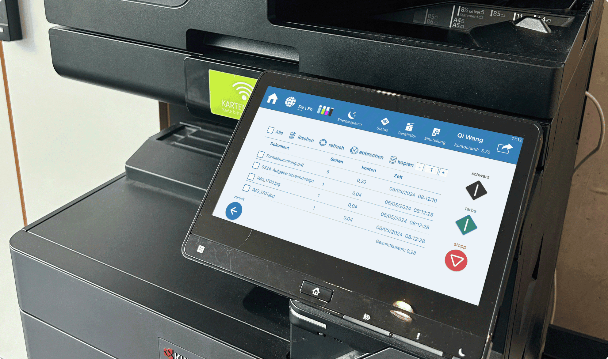
Poor feature visibility
Unstructured layout
Lack of language options
Cluttered interface
Inefficient workflow design
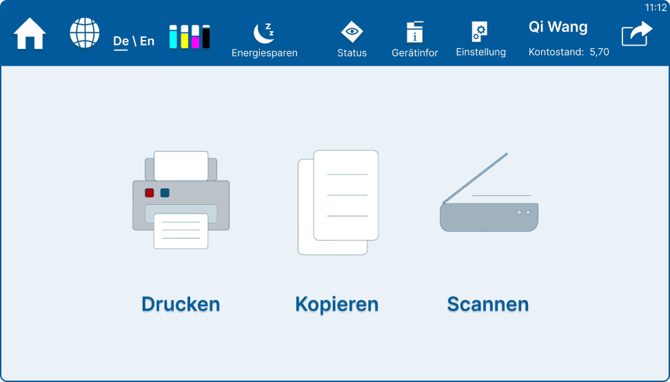
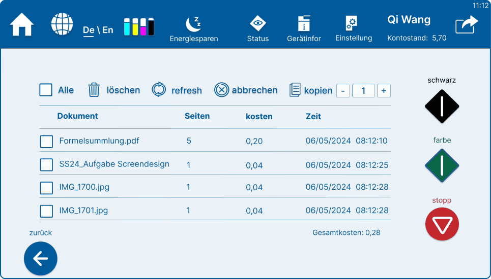
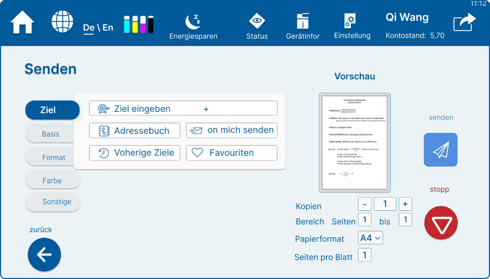
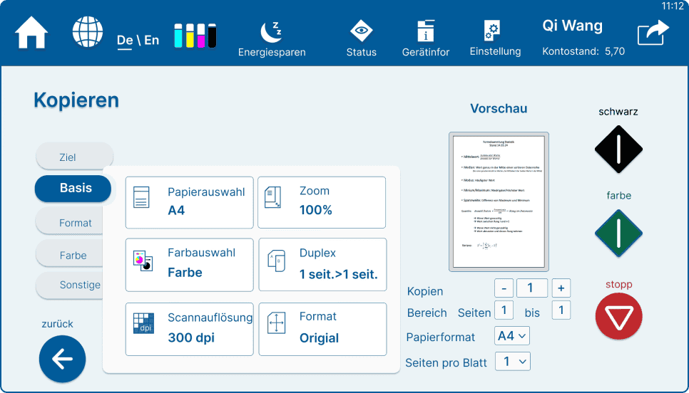
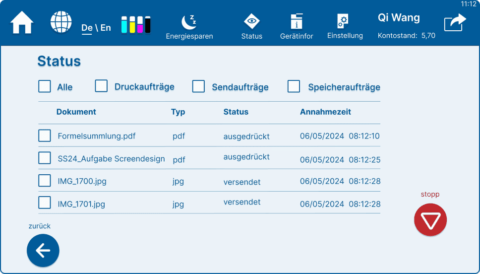
after redesign
It looks more organised and understandable now .
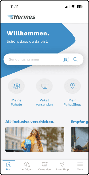
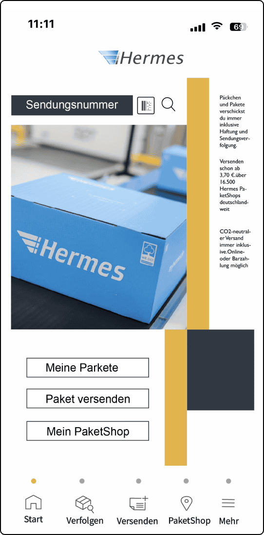
After analyzing the homepage interface of Hermes, I explored
alternative design approaches to enhance aesthetics and usability. I
created three variations based on distinct design styles

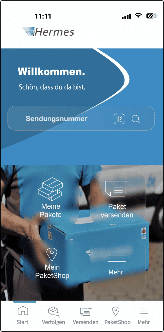
Glassmorphism
Neumorphism
Swiss Typography
A modern, futuristic look featuring translucent elements, soft
shadows, and frosted-glass effects to create depth and layering.
A minimalist and structured style emphasizing bold typography,
grid-based layouts, and strong contrast for clarity and readability.
A soft, tactile design approach that mimics physical surfaces using
subtle shadows and highlights, enhancing a sense of realism and
interactivity.
Back
Next