Icons and Interfaces
Design 1 Minimalist Eco-Themed Interface
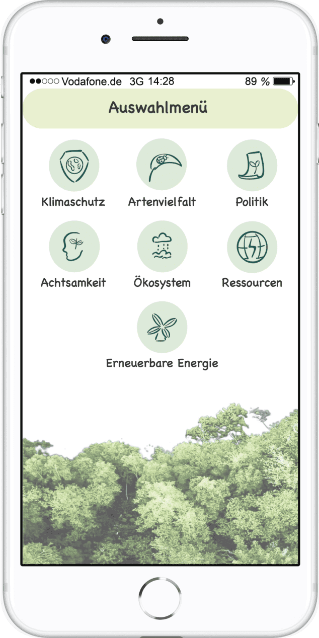
Design 2 Nature-Integrated Interface

 Sustainability-Themed Icon Design


The first design follows a minimalist approach, using delicate
line-art icons with a hand-drawn aesthetic. The icons are enclosed in
subtle square frames, creating a structured layout. The color palette
consists of earthy tones, with brown typography complementing the
nature-inspired theme. The background features soft, abstract organic
shapes, reinforcing the environmental focus of the interface. The
overall composition is clean and spacious, enhancing readability and
usability.
The second design embraces a more immersive nature theme,
incorporating a lush forest background that blends seamlessly into the
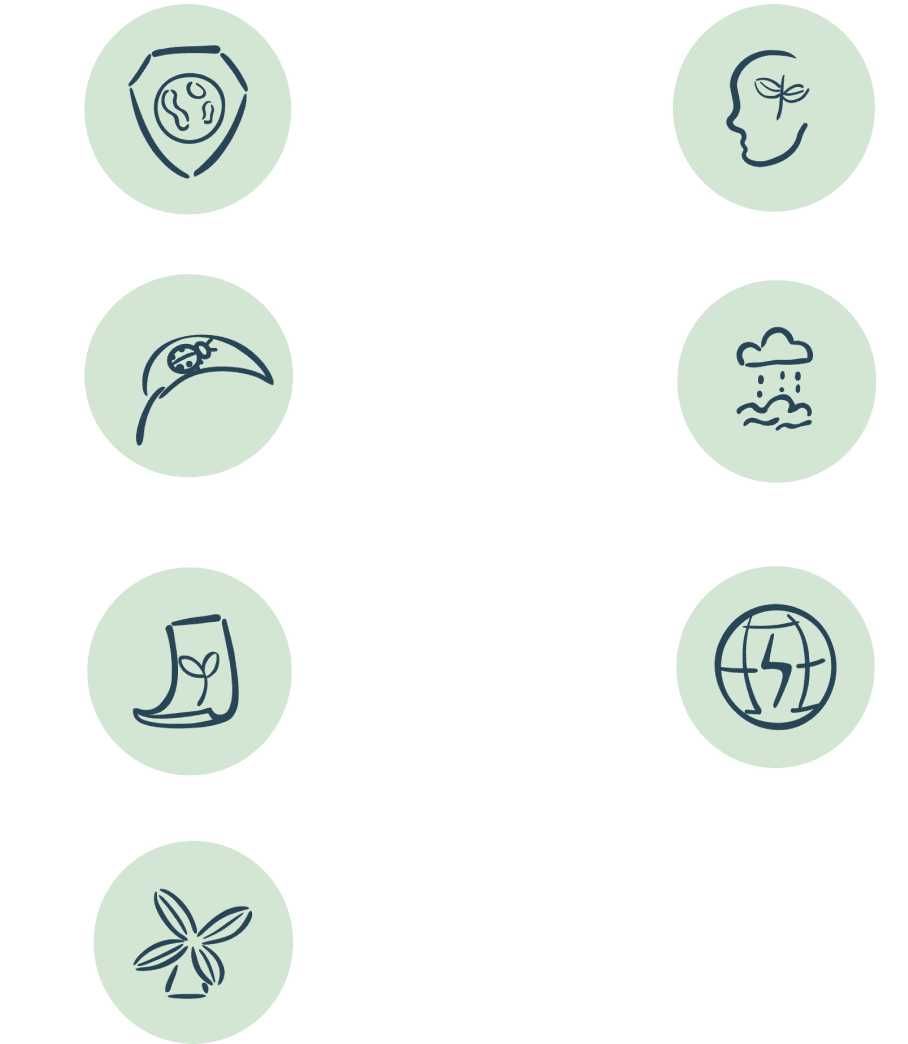
interface. The icons are round and filled with a soft green tone,
enhancing their visibility while maintaining an eco-friendly
aesthetic. The typography has a playful yet readable style,
reinforcing the app’s friendly and engaging approach. The overall
design is more visually dynamic, creating a stronger emotional
connection to the topic of sustainability.

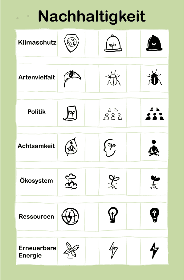
This project explores the visual representation of sustainability through a set of seven custom-designed icons
- Climate Protection (Klimaschutz)
- Biodiversity (Artenvielfalt)
- Politics (Politik)
- Mindfulness (Achtsamkeit)
- Ecosystem (Ökosystem)
- Resources (Ressourcen)
- Renewable Energy (Erneuerbare Energie)
each symbolizing a key aspect of environmental responsibility
